FAVRE LEUBA
WEBSITE UI/UX
— Conquering frontiers for 287 years —
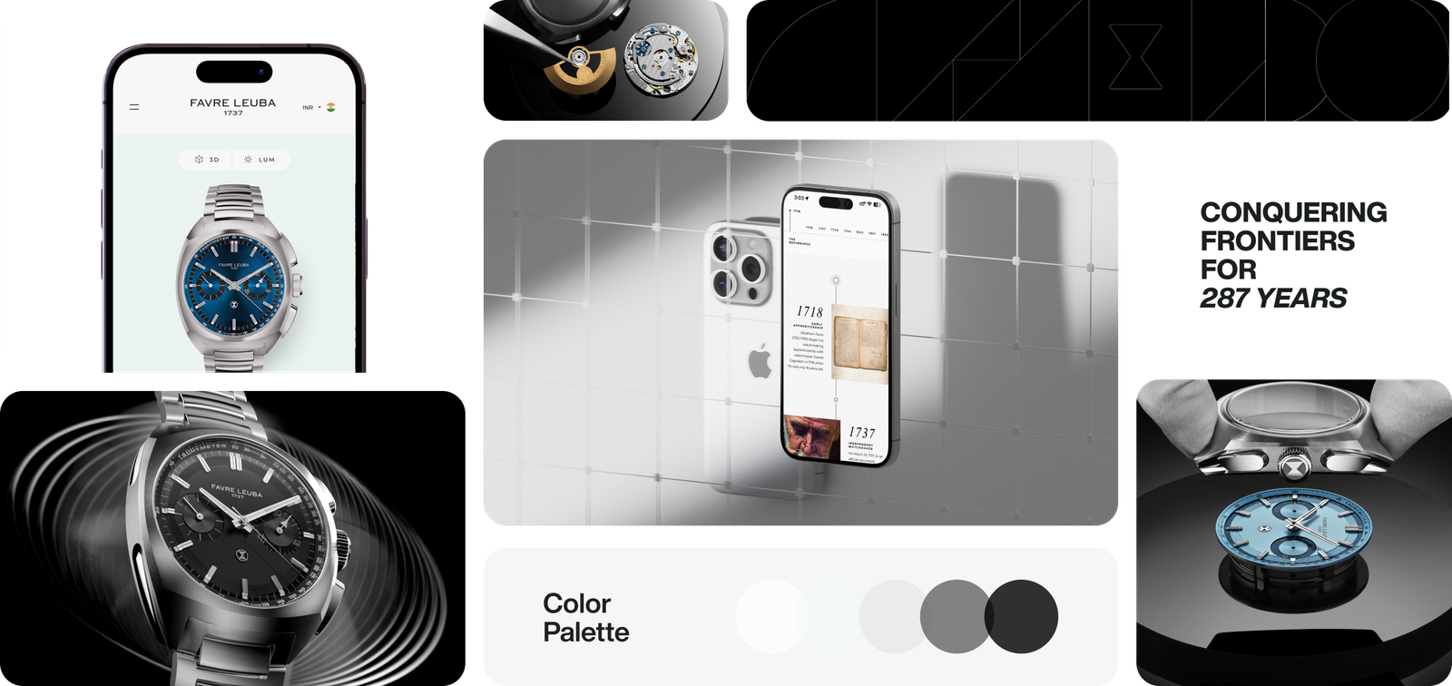
● About Brand
Founded in 1737, Favre-Leuba is not just one of the oldest Swiss watch brands but a significant part of horological history. With a legacy of over 288 years, the brand has consistently pushed the boundaries of innovation, introducing landmark models such as the Bivouac, the first mechanical watch equipped with an aneroid barometer for measuring altitude, and the Bathy, one of the first watches to display dive depth.
Project Timeline:
2022 - 2025
Role:
Head of Design
(Full Time)
Project Skills:
UI/UX
Industry:
Luxury Watches
● Scope of work
The redesign of the Favre Leuba website is a strategic move to enhance its digital presence and reinforce the brand's iconic position as a leader in the luxury watch industry. The new website, with its black-and-white luxury user interface, is not just a design choice, but a reflection of the brand's commitment to excellence, craftsmanship, and timeless design. It will also integrate the latest technologies, ensuring optimal performance across all devices while maintaining a practical user experience.
Deliverables
– Strategy
– User Interface

● Strategy
The Favre Leuba, with its rich 288-year-old heritage, already has a website, but it needs to be updated. Inspired by this profound Ethos, our strategy focuses on simplicity, elegance, and ease of use to create a great user experience.
Start by designing a clean, straightforward menu to help users find collections quickly, with clear categories and an advanced search (we're still working on it). High-quality images with a 10x zoom and a 360-degree product view feature add an interactive touch, allowing users to enjoy the details on the watches virtually, making the browsing experience comfortable and enjoyable.
Product pages should highlight the craftsmanship and brand heritage through detailed descriptions and storytelling. The checkout process should be smooth, with a guest option, secure payment choices, and warranty info. Since the traffic is shifting to mobile, we ensure the website is fully responsive with easy navigation and mobile-friendly filters. Personalized recommendations, live chat support, and options to consult with watch experts add extra care, making the shopping experience feel exclusive and refined, ensuring each customer feels special and valued.
I. Define: We started the project with a discovery workshop to interview the department’s experts and identify the platform's key challenges, opportunities, and goals.
→ Expert interviews
II. Research: The Ultimate Goal is to revive a brand’s website with a positive objective that involves blending the brand's rich heritage with modern digital expectations. The goal is to preserve the brand’s legacy while making it relevant and engaging for today's users.
→ UX Strategy


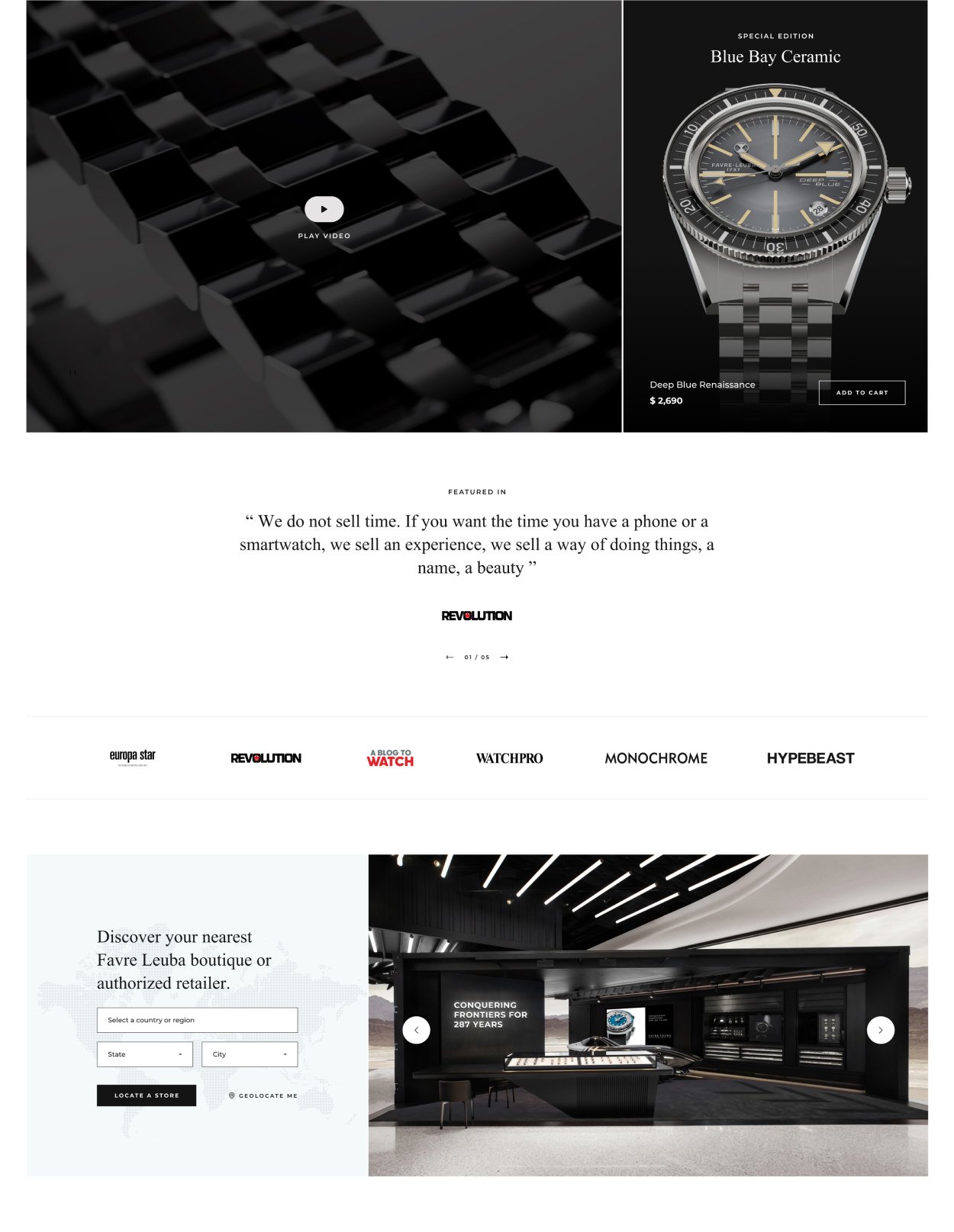

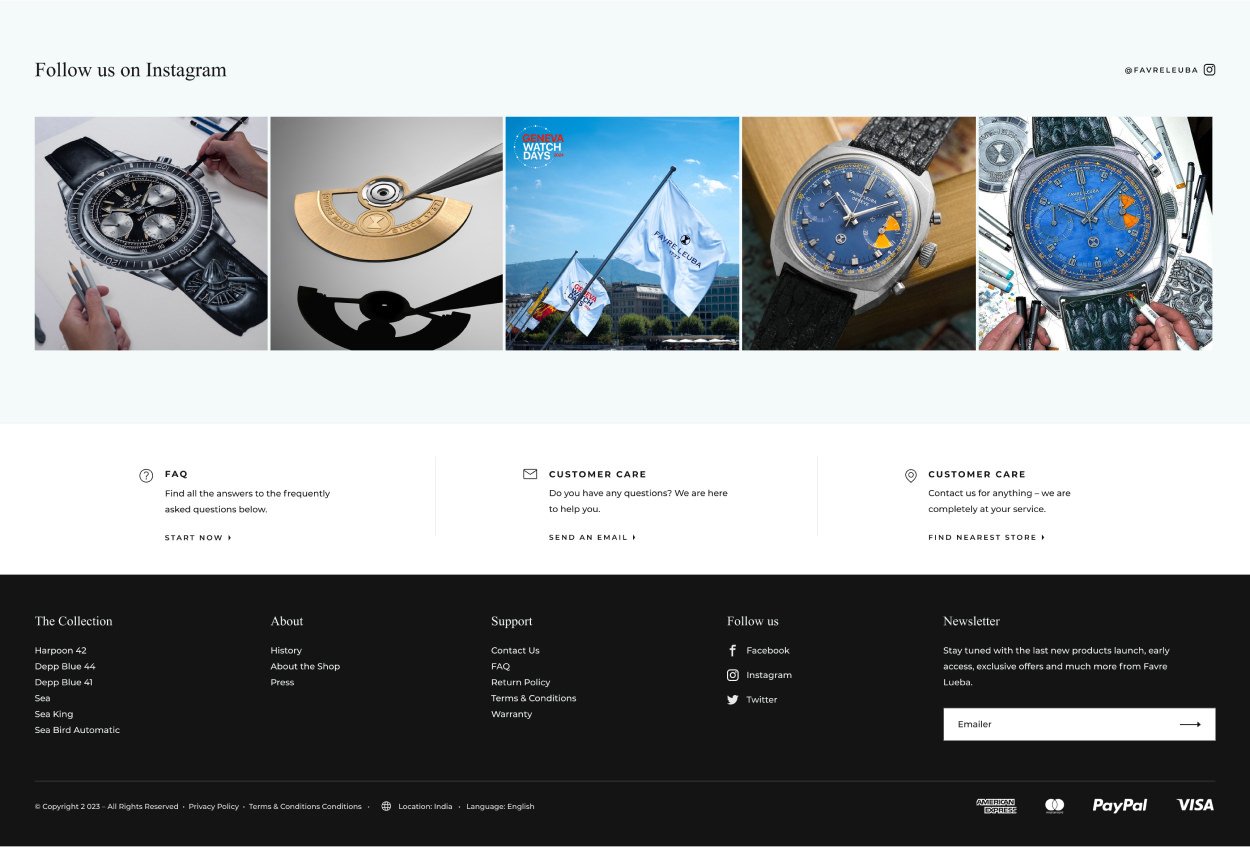


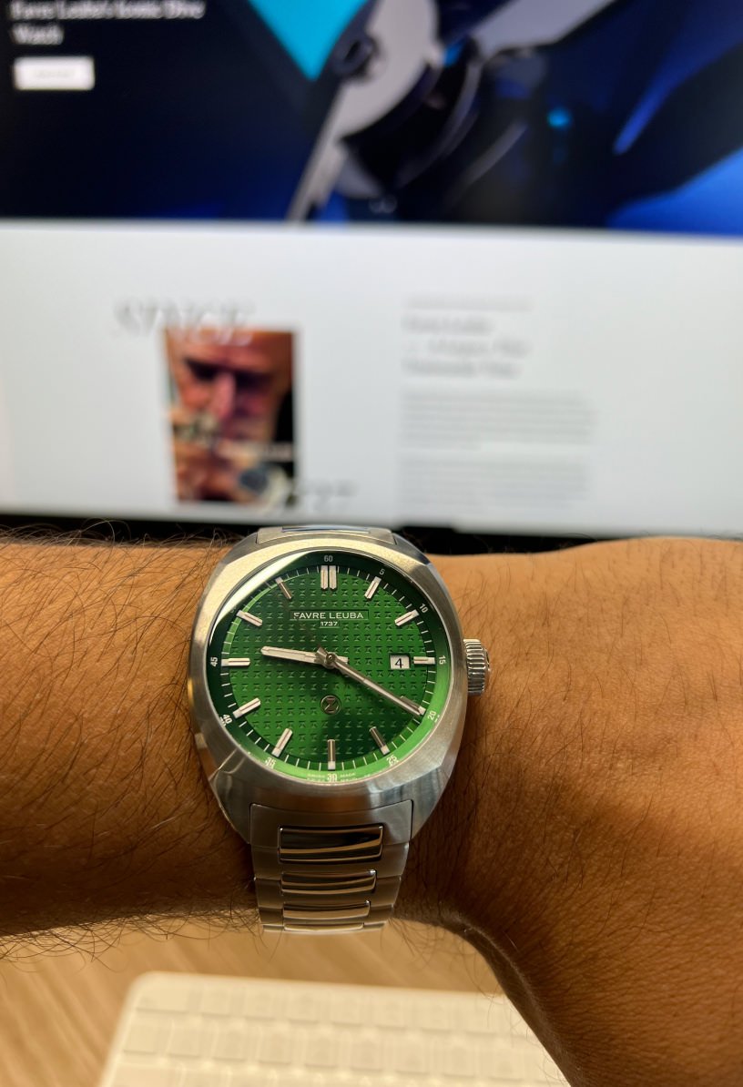
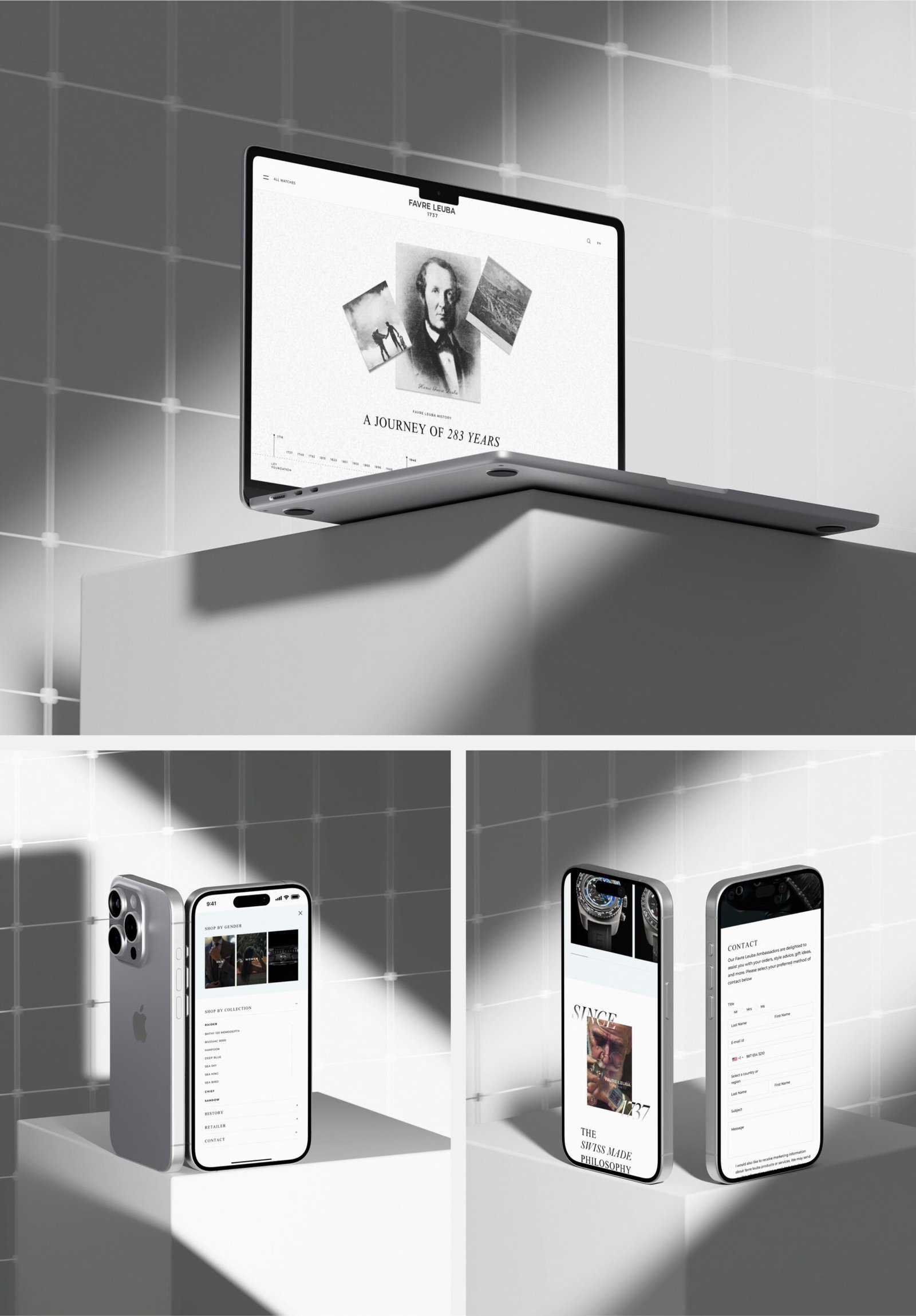
→ Behind the scenes: Here are some sneak peeks from behind the scenes of the project I worked on. These aren’t special images—just random shots.

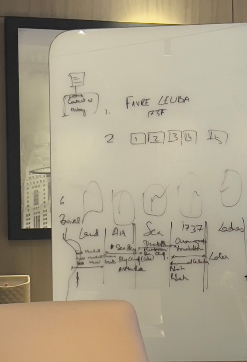
III. Flow: Next is the flow—mapping the user journey to gather early usability feedback. A well-defined user flow makes interfaces easy to navigate, allowing users to move intuitively from one step to the next. It aligns design with business goals, ensuring each step brings users closer to desired outcomes, such as sales or leads.
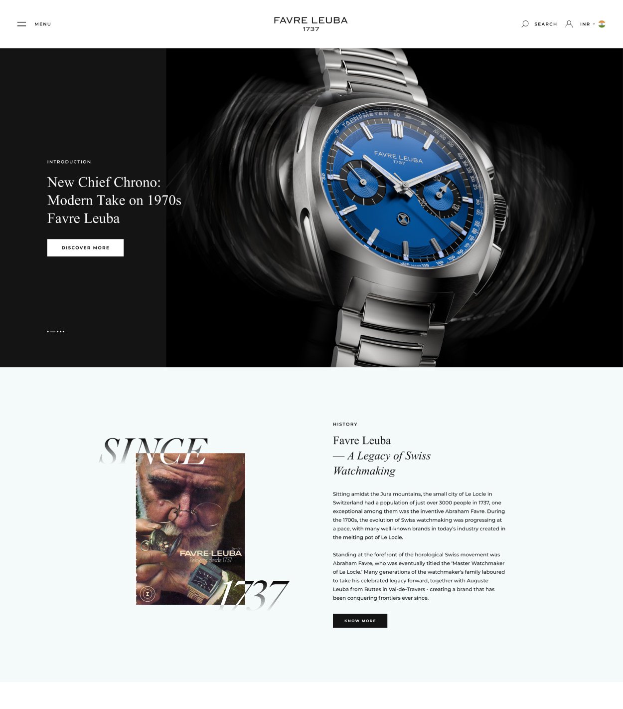
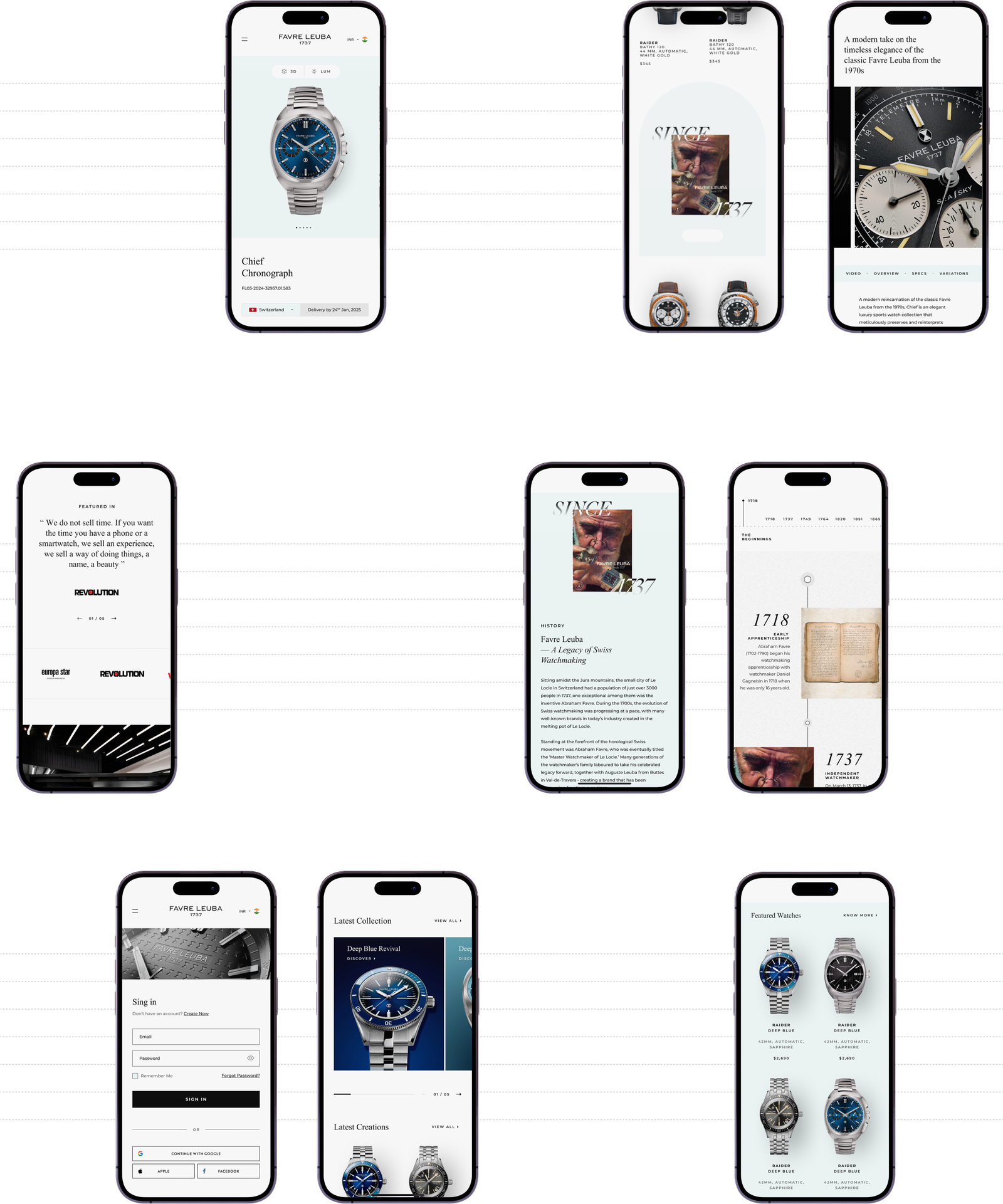
→ The 2024 version: This is the current version, but you may see something different if you’re checking in 2025. We’re rolling out changes quickly. 😊
● User Interface
To kick off the UI redesign, I started with a solid research foundation—analyzing user feedback, identifying pain points, and studying behaviour patterns to understand what needed improvement. Working with an existing website, my primary goal was to reimagine it with a fresh, engaging look. Drawing on over a decade of experience examining watch websites—from global brands to boutique luxury labels entering the Indian market—I was focused on making the design feel light, approachable, and tailored to our audience’s tastes, avoiding the heavier aesthetics common to many competitor sites.
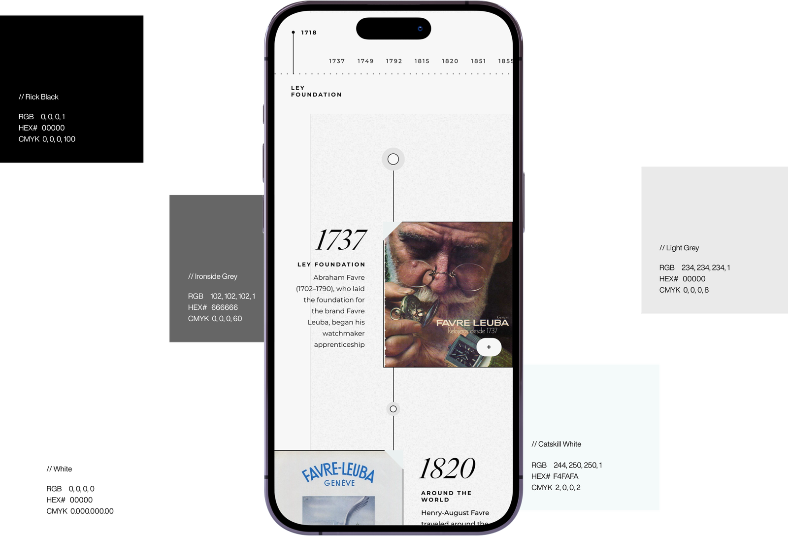
With our research insights, we set clear objectives to guide the redesign. This included improving navigation, enhancing visual appeal, and boosting conversion rates. Competitive analysis was key for relevance, but giving the design a unique, recognizable touch that aligns with the brand’s identity was equally important. This meant carefully selecting colours, typography, and stylistic elements that reflected the brand consistently across the interface.
A few of them are:
→ Typography
→ Color Palette
→ Grid System
→ Iconography
→ Typography: The primary typeface is Montserrat, and it should be used across all communications, both print and digital. Montserrat is the default font for most text, including body copy, para, form, buttons, etc., and comes in five main weights to offer useful variation. The italic versions of these weights are perfect for emphasizing entire sentences or just a single word. Additionally, we have an alternative typeface, Times New Roman, which can be used for headings, captions, and other specific elements.



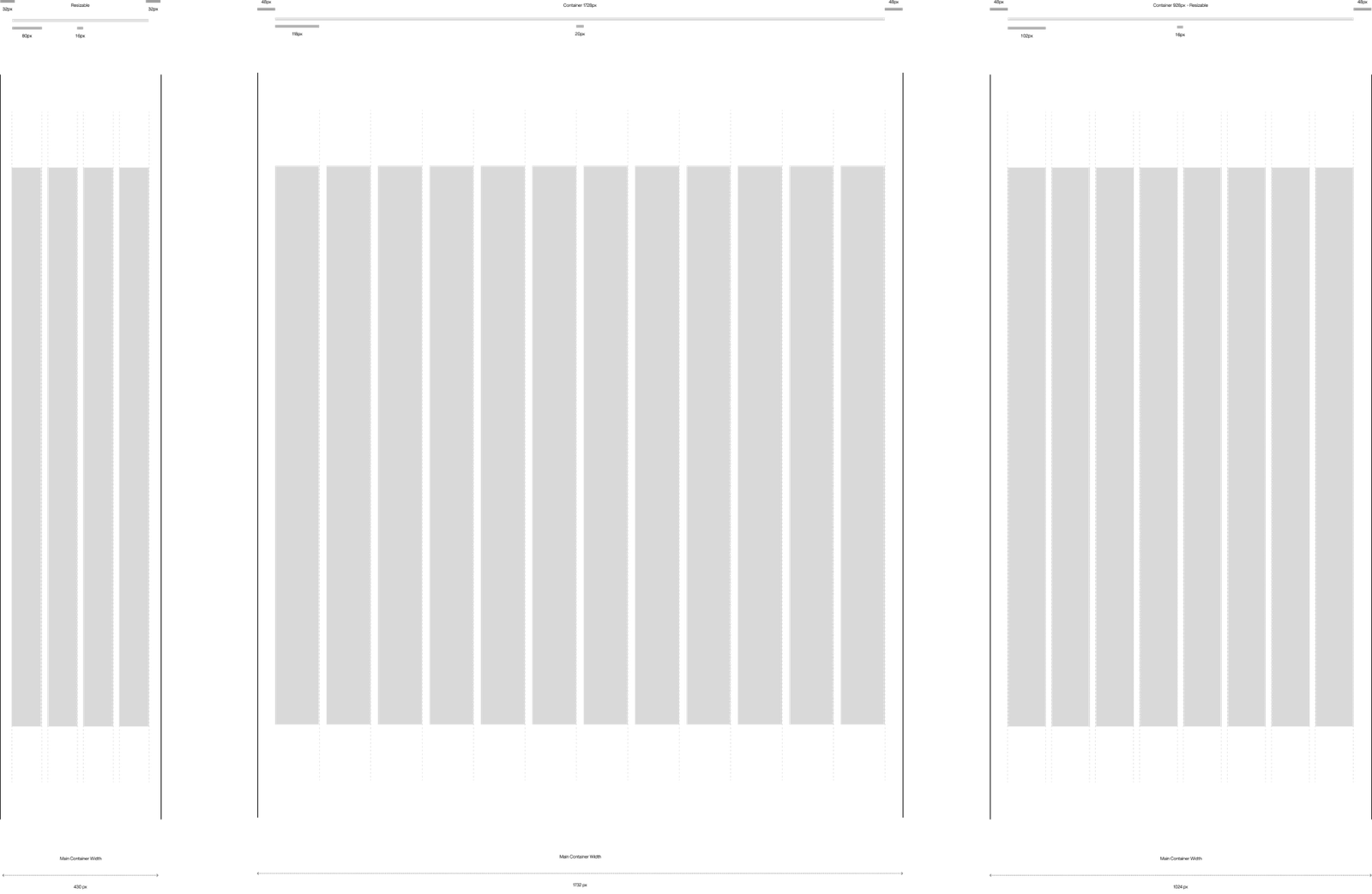
→ Grid System: I implemented a grid system to create a balanced and organized layout, ensuring consistency across all sections. Using a 12-column, 8-column, and 4-grid, I could easily divide content and align elements, creating a structured flow that enhances readability and visual hierarchy.
→ Iconography: Besides the grid system, I incorporated iconography to reinforce the visual language and enhance usability. Each icon was carefully chosen to align with the brand aesthetic and functionality, serving as a quick visual cue that aids navigation and reinforces the overall theme.
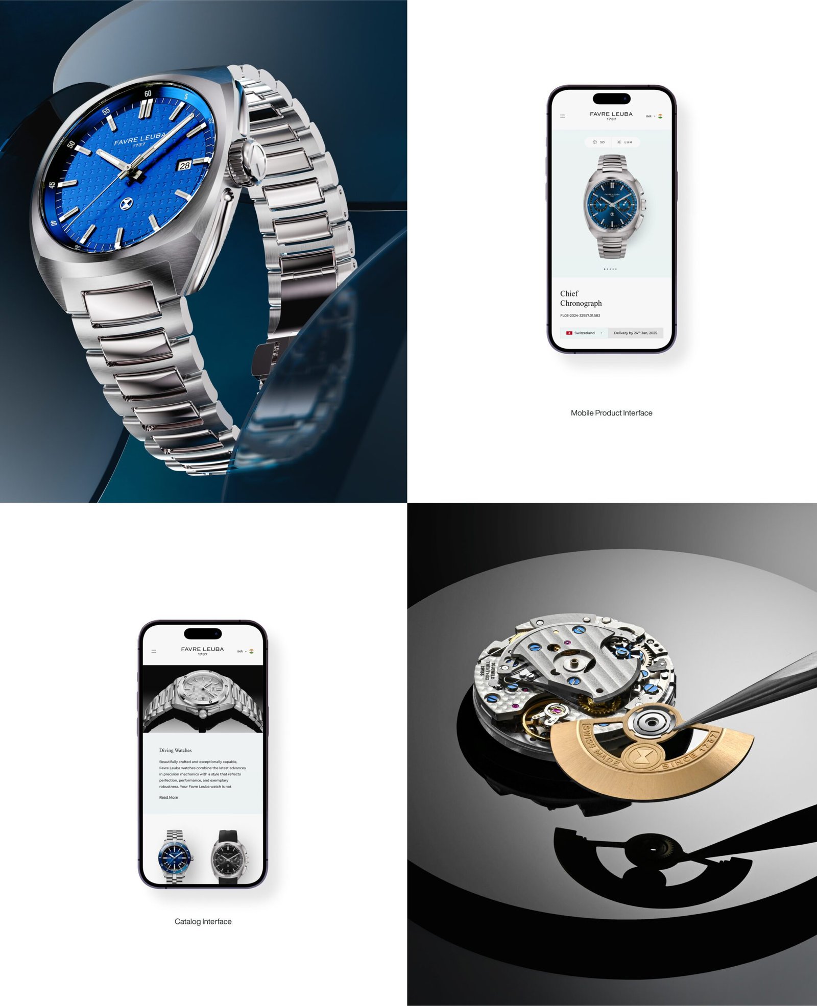
→ New Product: Catch a first glimpse of the new Favre-Leuba collection—a bold blend of heritage and modernity, crafted to stand out.
Project Owner
Favre Leuba
Location
N: 29, ° 15'0
E: 76, ° 119'59
HAVE A
PROJECT IN
MIND?
LET'S TALK シ
.
Designed & Developed by Rajinder S Gill — Version 2.0 // © 2011 - 2026