ETHOS WATCHES
WEBSITE UI/UX
— India's largest Luxury Watch Retailer —
● About Brand
Ethos is India's leading luxury watch retailer with over 30 years of experience in the industry and 65 boutiques across the country. The company exclusively offers premium Swiss brands, including Rolex, Omega, IWC, TAG Heuer, and more. They also offer watch service to ensure each timepiece remains in impeccable condition.
Project Timeline:
2011 - 2024
Role:
Head of Design
(Full Time)
Project Skills:
UI/UX
Industry:
Luxury Watches
● Scope of work
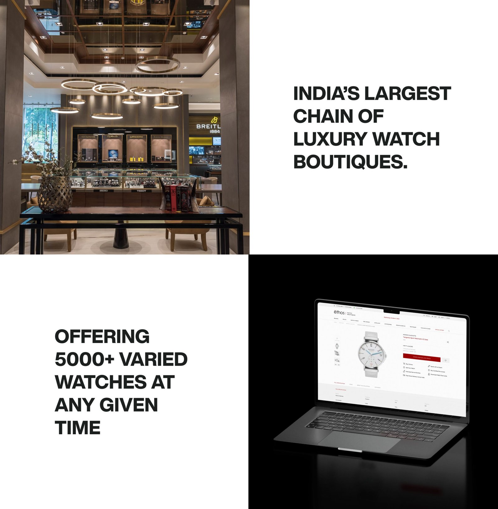
Since 2011, we’ve designed nearly five website versions, with the latest launched in 2020. From the outset, our goal was clear: to boost leads and highlight our expertise, primarily focusing on audiences aged 30+. The home, catalogue, and product pages were at the heart of the redesign. With a catalogue of over 10,000 watches at Ethos, we prioritized a seamless, intuitive browsing experience, which meant dedicating significant time to code optimization for speed and usability rather than just visual design. Our target was an impressive load time of 1-2 seconds, and we’ve worked diligently to ensure high rankings on Google’s speed metrics.
Deliverables
– UX Strategy
– User Interface
Note: If you’re viewing this design in 2025, it may look different, as a new version is currently in development and will be showcased soon in my portfolio.
" We want the world's best luxury website in India. Let's do it! And, of course, we need this up and running in 30 days! We're not joking. "
Ethos Watches
Top Management
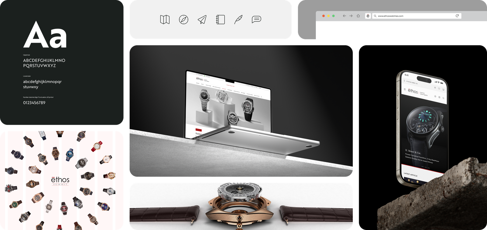
Desktop version: www.ethoswatches.com
● UX Strategy
Before diving into the work, it's important to know that UX typically follows certain foundational steps. However, as I highlighted in the challenges at Ethos, there was no dedicated UX team, so I was solely responsible for all design aspects. This meant many shortcuts were taken, and standard UX practices couldn't be fully implemented. Some Key UX Challenges at Ethos:
→ No strong tech team or UX testing team
→ No UX writer to support content design
→ No dedicated UX tester to validate designs
I. Define: We launched the project by holding a discovery workshop. During the workshop, we interviewed department experts to uncover key challenges, identify opportunities, and set clear goals for the platform.
→ Expert interviews


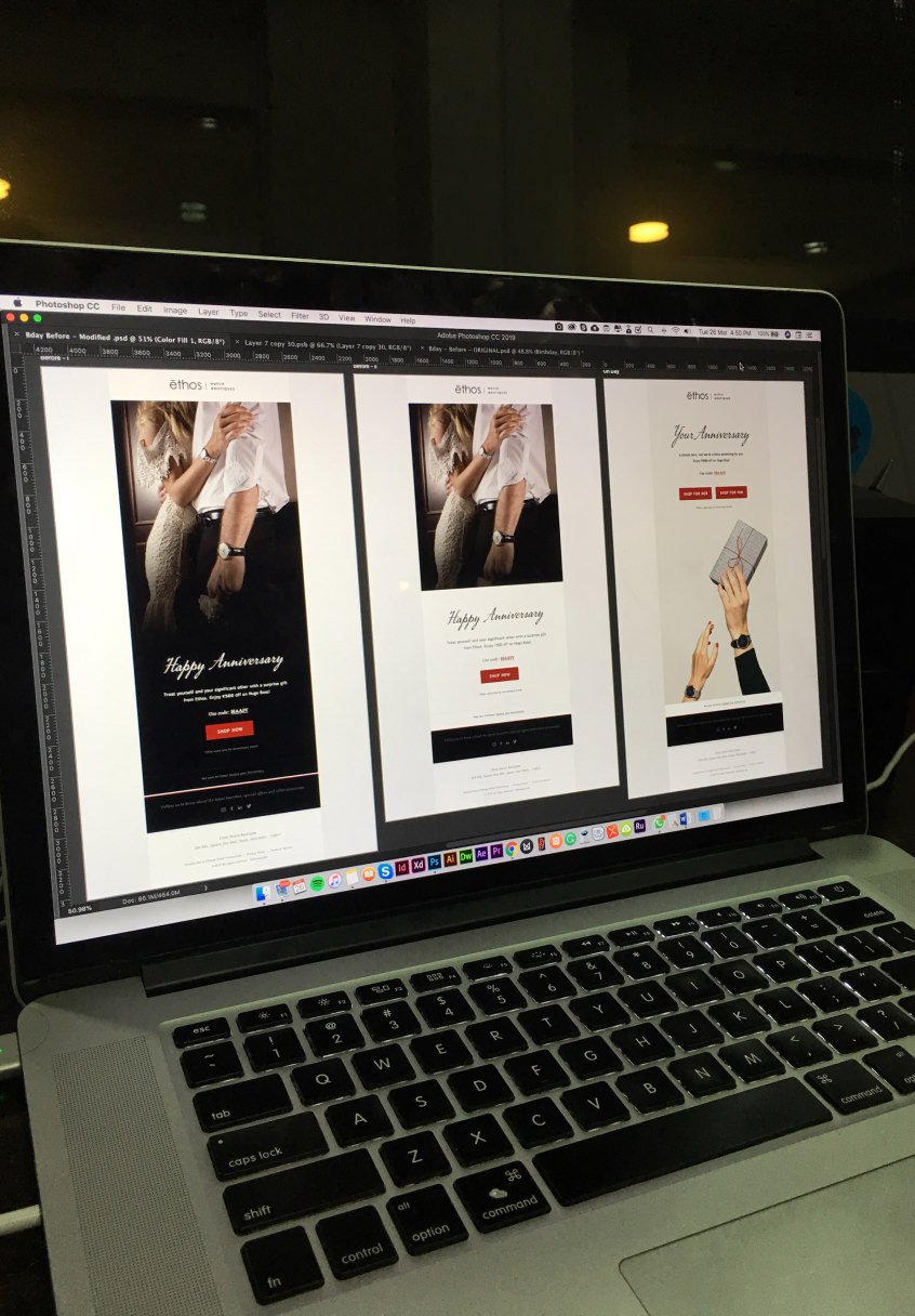
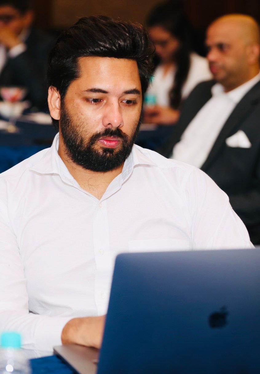
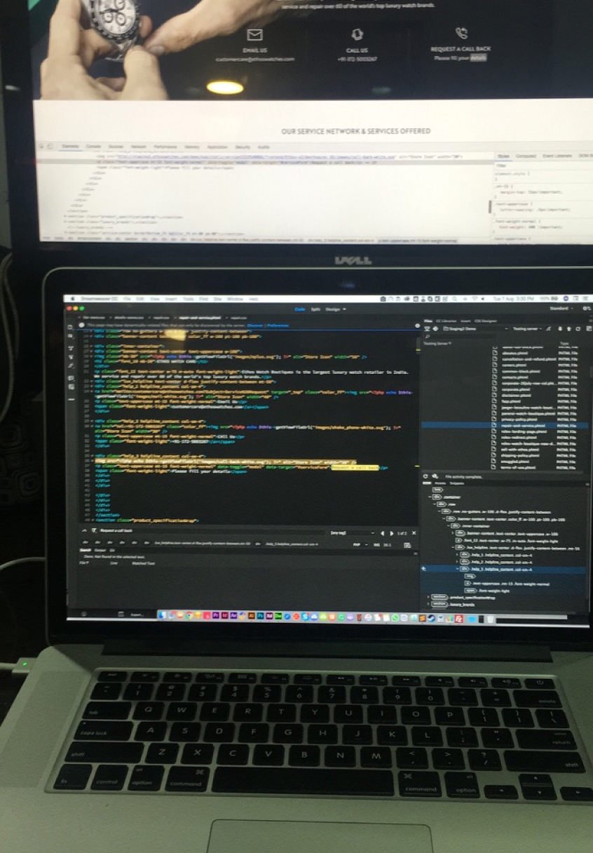
→ Behind the scenes: It’s a mix of random shots, working through all kinds of situations, and endless tweaks. There’s constant testing, rethinking, and adjusting to make things right. It’s not always glamorous, but every step comes together to create something meaningful and functional.
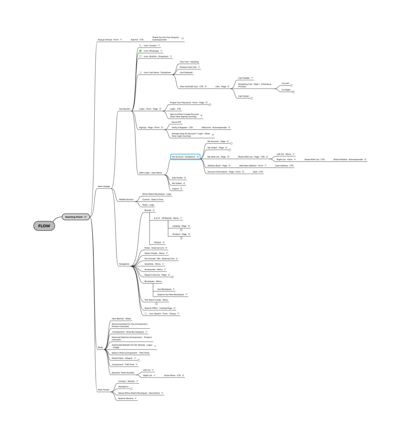
II. Research: Next is the user flow—planning how users will move through the interface to gather early feedback. A clear user flow makes navigation easy, helping users move naturally from one step to the next. It also aligns the design with business goals, ensuring each step brings users closer to desired results, like sales or leads.
mobile version: www.ethoswatches.com
● User Interface
To begin the UI redesign, I started with solid research—looking at user feedback, finding problem areas, and studying how people use the site to see what needed fixing. Since I was working with an existing website, my main goal was to give it a fresh, more engaging look. With over ten years of experience studying watch websites—from big global brands to smaller luxury labels entering the Indian market—I wanted the design to feel light and welcoming, unlike the heavy styles found on many competitor sites.
Based on the research, we set clear goals for the redesign: improve navigation, make the design more visually appealing, and increase conversions. We also looked at competitors to stay relevant but focused on making our design unique and aligned with the brand’s identity. This meant carefully choosing colors, fonts, and design elements to make sure the brand was reflected well throughout the site.
Key elements we focused on:
→ Typography
→ Color Palette
→ Grid System
→ Iconography
→ Typography: The primary typeface is Montserrat, and it should be used across all communications, both print and digital. Montserrat is the default font for most text, including body copy, para, form, buttons, etc., and comes in five main weights to offer useful variation. The italic versions of these weights are perfect for emphasizing entire sentences or just a single word. Additionally, we have an alternative typeface, Times New Roman, which can be used for headings, captions, and other specific elements.
→ Color Palette: First things first, fonts & colours. At Indicius, we know that a great branding process starts with defining the message behind the brand: Its mission, vision, values, personality, competitive advantage, and a deep understanding of what its customers want and need.
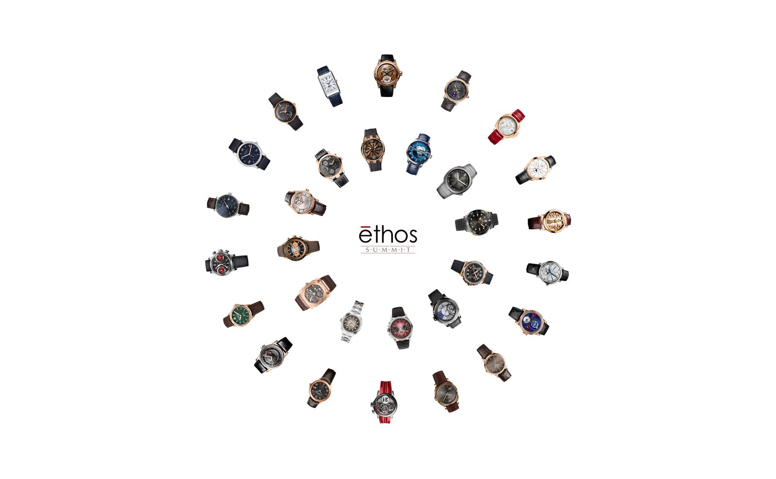
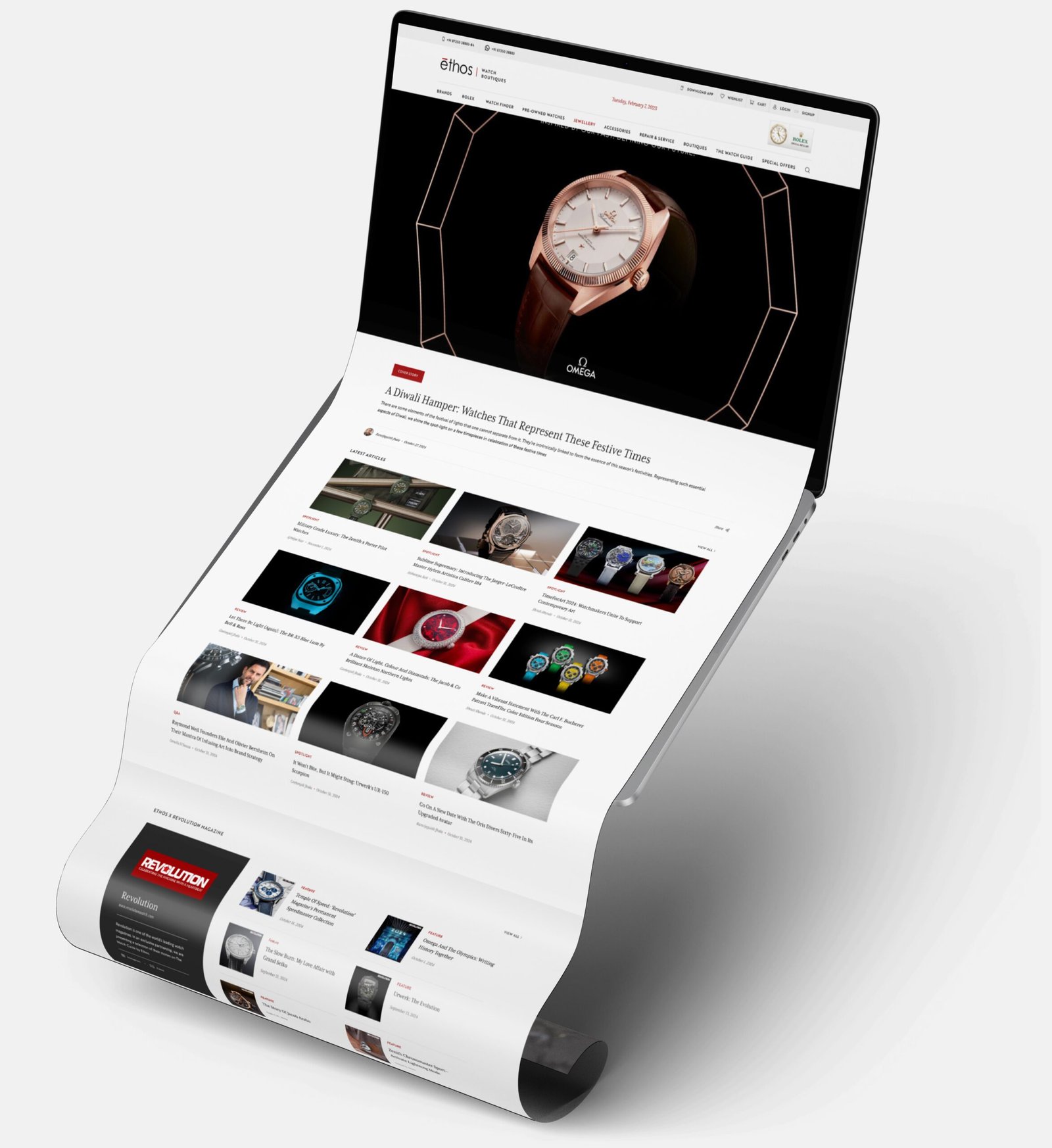
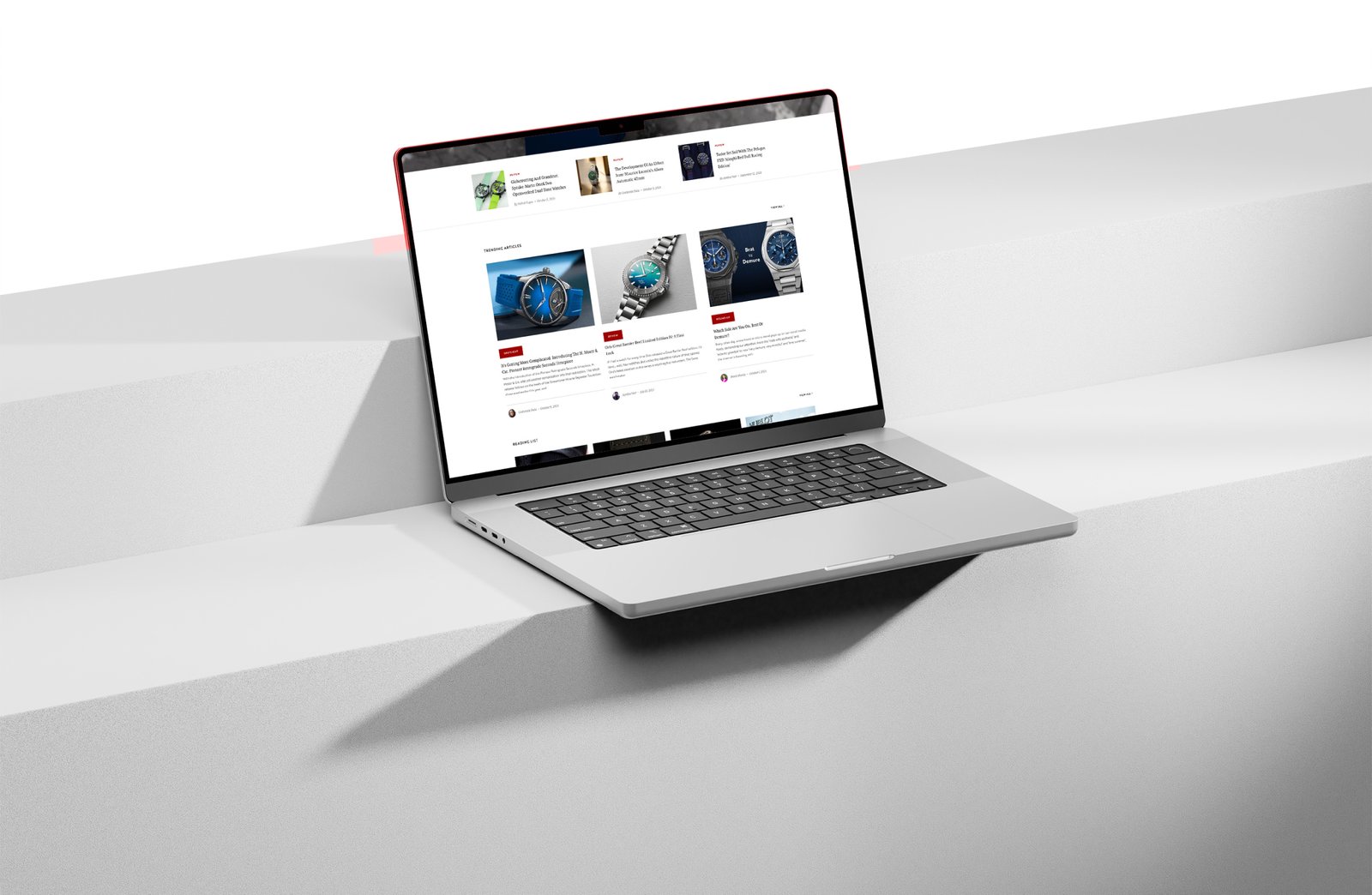
→ The 2020 version: This is the current version, but you may see something different if you’re checking in 2025. We’re rolling out changes quickly. 😊
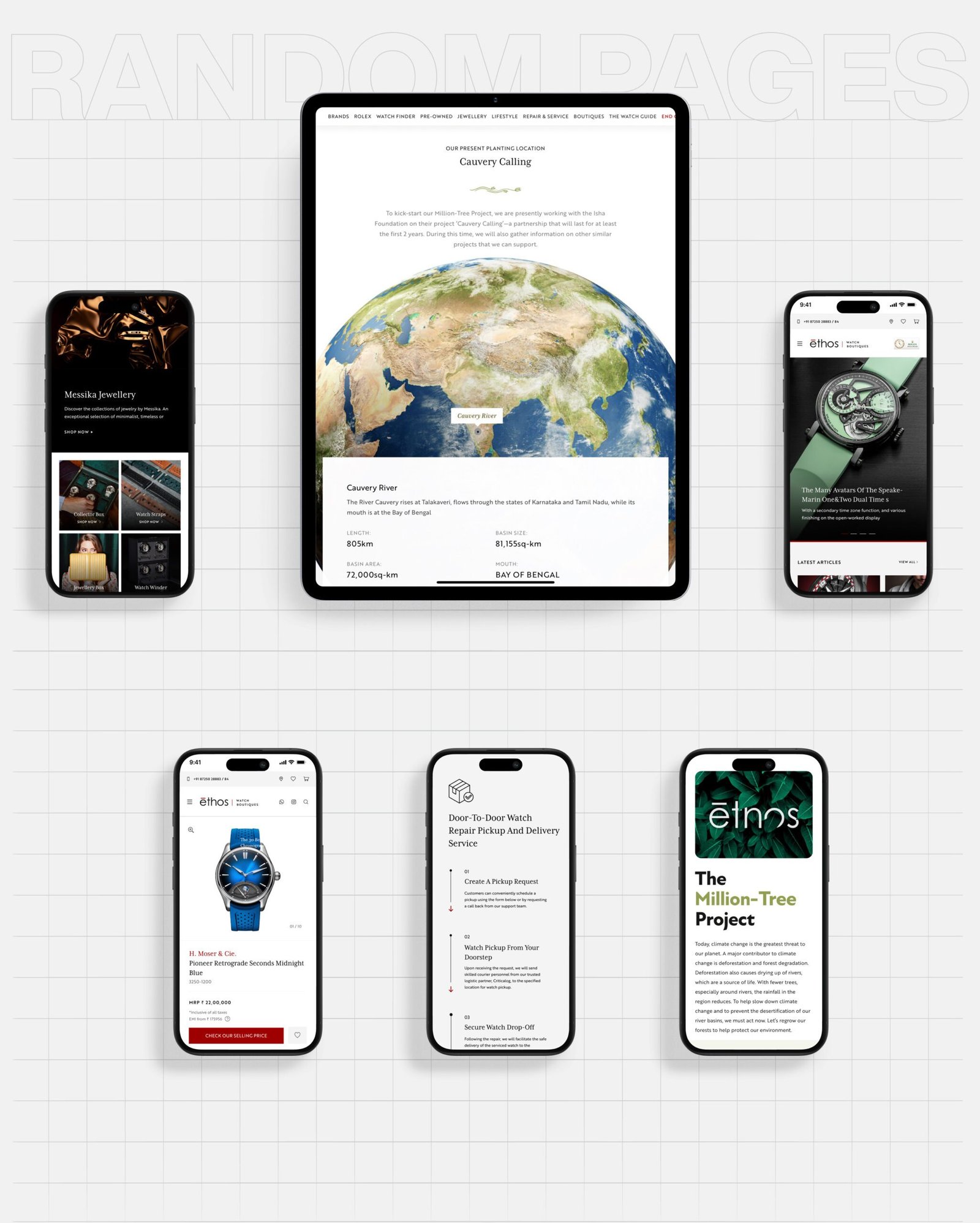
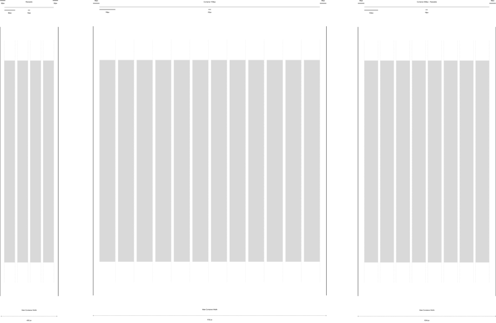
→ Grid System: The 12-grid system is a versatile and widely-used framework in design, ensuring balance and consistency across layouts. By dividing the canvas into 12 equal columns, it allows for flexible combinations—spanning one, two, three, or more columns—making it ideal for responsive designs.
→ Iconography: User Interface (UI) Design focuses on anticipating what users might need to do and ensuring that the interface has elements that are easy to access, understand, and use to facilitate those actions. Following are the few part which make the UI look better, when its come to overall design:
● Results
In our branding workshop we defined Arena as the trailblazer of hiring tools, transforming the labor marketing by cutting uncertainty and bias out of the hiring process. This was reflected in Arena’s new Style Tile, which included an exciting new color palette and human-centered imagery that reflected Arena’s values. This formed the basis for a UI Library that kept on growing as we went along.
And that’s how the journey were with Ethos...
● The Experience
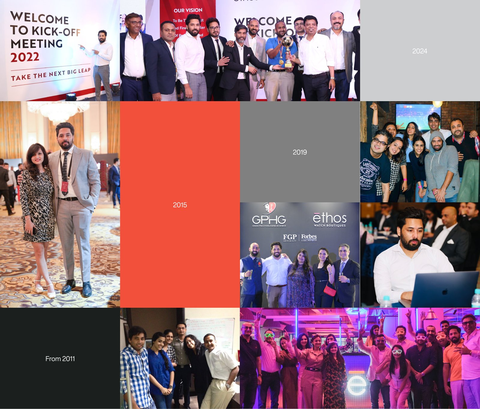
Spending almost 14 years with the Ethos team has been extraordinary. Along the way, I’ve created some amazing memories with colleagues who have become lifelong friends.
A special thank you goes to Mr Pranav Saboo, the CEO of Ethos, who believed in me and gave me a chance despite my being a college dropout. His faith in me marked the beginning of an incredible journey.
It’s been fascinating to witness the transformation—from a modest space in Chandigarh to an impressive setup in the bustling millennium city of India, Gurgaon.
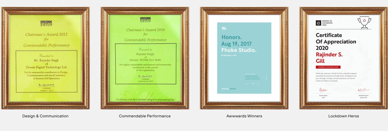
Here are some of the awards and certificates I’ve had the privilege to receive during this time:
→ Awards & Recognition: Employee of the year, Lockdown Hero, GPHG event maker, etc
Project Owner
Ethos Ltd
Location
N: 29, ° 15'0
E: 76, ° 119'59
HAVE A
PROJECT IN
MIND?
LET'S TALK シ
.
Terms of Use — Privacy Policy
Designed by Rajinder S Gill — Version 2.0 // © 2011 - 2026