
Choosing the perfect sans-serif font can be quite a challenge. If you're a new designer, you've probably gone through countless font collections on the web or social media reels. From the 1920s to the 2010s, selecting a font was a relatively straightforward task since there were limited font options. Fast forward to 2023, and the font game has become a bit trickier.
I've been down that road, and in this article, I'll share a list of 10 sans-serif fonts that can simplify your font selection process. These fonts will never go out of style, even if you're reading this article in 2050, and I promise it will save you time. A vast collection of fonts will lower your speed while designing projects, whether for web projects, logos, or offset printing. It's worth noting that some fonts are paid, but you can usually find trial versions on official websites or other sources to give them a test run.
These are well-known companies that have used sans-serif fonts in their logos!
As we wrap up, I will address some frequently asked questions (FAQS), offer insights on when to use sans-serif fonts, explain what sans-serif means, delve into the origins of the first sans-serif font, and, of course, provide you with resources to snag these fonts for yourself. Stay tuned!
01. Helvetica now

This is one of my all-time favourite fonts. I am using this on this website, too. This is one of the oldest fonts in the history of typography. The original name of this font was Neue Haas Grotesk, developed in 1957 by Swiss typeface designers Max Miedinger and Eduard Hoffmann. As of Today, Helvetica contains 36 styles and family package options from Helvetica Pro Light to Helvetica Pro Black Oblique. Along with Condensed, Black Condensed, Compressed, Extra Compressed, Ultra Compressed, Narrow Roman, Rounded Black insert Roman.
It also has a good collection of Glyph Counts, with more than 120, which you can edit and play around with to add a more customised look.
Where can you buy it, and how much does Helvetica cost now?
This font can be purchased from MyFonts and costs around $ 500 or more, depending on the number of styles you want to purchase. However, the individual font price starts at $39.
Date released
1957
Designed by
Max Miedinger
Number of fonts in Complete Family Pack
96 Typefaces
Licence
Paid
02. Proxima Nova
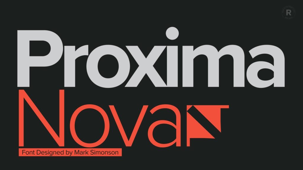
Proxima Nova was originally released in 1994 as Proxima Sans (now discontinued) with a limited number of options like Regular, Medium, and Black (with italics). It is often described as a hybrid of Futura and Akzidenz Grotesk, combining a geometric appearance with modern proportions.
The font gained recognition, with Rolling Stone magazine incorporating it into its 2003 redesign. Encouraged by the positive response, Simonson revisited his creation, and in 2005, Proxima Nova emerged—an extensive family of 42 fonts with advanced OpenType features. Simonson meticulously refined every aspect, expanding the character set, improving hinting for on-screen display, and enhancing spacing and kerning.
Since its initial release, Proxima Nova has evolved over a decade, with Simonson continually fine-tuning and expanding the family. Adding new weights, improved language support, and a commitment to typographic excellence have solidified Proxima Nova's status as a versatile and enduring typeface, a testament to Simonson's dedication to the craft. With 48 fonts in the family, Proxima Nova remains a staple for designers seeking a harmonious blend of modernity and timeless design.
Where can you buy it from, and how much does Proxima Nova cost?
With a Creative Cloud subscription, you can access this font for free on Typekit. If you prefer to purchase it for a client, you can buy it from Fontspring. The cost for all 48 fonts is approximately $ 1,152. The cost for all 48 fonts is approximately $1,152. Keep in mind that the cost may vary from country to country.
Date released
1994
Designed by
Mark Simonson
Number of fonts in Complete Family Pack
48 Typefaces
Licence
Free + Paid
03. Futura PT
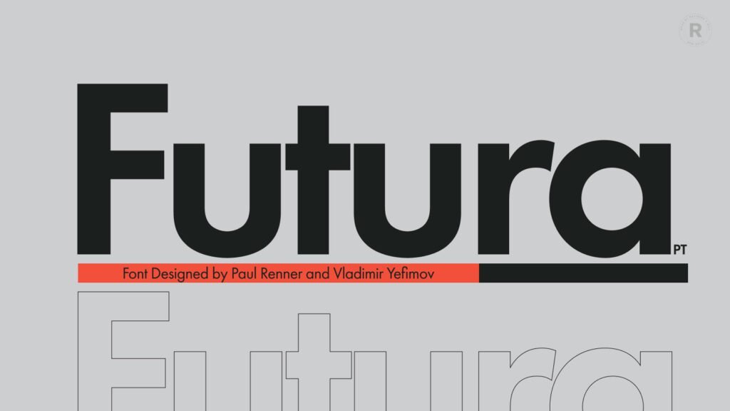
Designed by Paul Renner for Bauersche Gießerei in 1927, Futura stands as an iconic typeface rooted in the simplicity of geometric forms, echoing the aesthetics of 1920s and 1930s constructivism and the Bauhaus.
Futura PT, the most comprehensive Cyrillic version of Futura, offers a versatile type system comprising 25 styles, ranging from Thin to Extrabold, including 16 regular and 9 narrow options. With features like linear and old-style figures, subscripts, and fractions, Futura PT caters to a diverse range of design needs. Supporting over 100 languages, it encompasses Western and Central European Latin, as well as Cyrillic-based languages from Russia and the countries of the former Soviet Union (CIS).
Vladimir Yefimov, the mastermind behind the Cyrillic version of Futura, initially crafted it between 1991 and 1995. In 2007, he undertook a partial redesign, establishing a cohesive system. Isabella Chaeva contributed additional styles. Released under the name Futura PT, the typeface continued to evolve. In 2022, Chaeva returned to enhance Futura, introducing three new styles, old-style figures, and expanded Cyrillic support.
Futura, a registered trademark of Bauer Types, SL, transcends time, seamlessly blending historic influences with contemporary design needs.
Where can you buy it from, and how much does Proxima Nova cost?
If you're interested, you can grab the entire package of 22 fonts from MyFonts for around $450. Alternatively, if you have an Adobe Creative Cloud subscription, you can download them for free. Remember that you might also find these fonts available on the internet, but using them without a proper license is not recommended.
Date released
1927
Designed by
Paul Renner for Bauersche Gießerei (Bauer)
Number of fonts in Complete Family Pack
22 Typefaces
Licence
Free + Paid
04. Open Sans

Among the top 10 fonts highlighted in this article, Open Sans stands out as a 21st-century design marvel. Embodying modern elegance, it brings a fresh and contemporary touch to the world of typography.
Crafted by Steve Matteson with help from Yanek Iontef, Micah Stupak, Meir Sadan, and Marc Foley, Open Sans is a humanist sans-serif typeface born in 2011 under Google's creative commission. It evolved from the groundwork of Droid Sans, initially tailored for Android devices but tweaked for a wider appeal.
Known for its user-friendly design, wide apertures and a generous x-height, Open Sans excels in legibility on screens and at smaller sizes. As a member of the humanist sans-serif family, it effortlessly sports a true italic style. By July 2018, Open Sans became Google Fonts' second most-used font, showing up on over four billion views daily across 20 million websites.
In a seamless upgrade in March 2021, Open Sans introduced a variable font version, extending its support to Hebrew characters. This update further cements Open Sans as an easy-to-love and widely embraced typeface.
Where can you buy it from, and how much does Open Sans cost?
These fonts are covered by the Open Font License, signifying that they are free to use. You can download them from Google as well as from Creative Cloud. Feel free to use them in your projects, whether for print or digital purposes, commercial or otherwise.
Date released
2011
Designed by
Steve Matteson
Number of fonts in Complete Family Pack
12 Typefaces
Licence
Completely Free + Subscription-Based
05. Inter
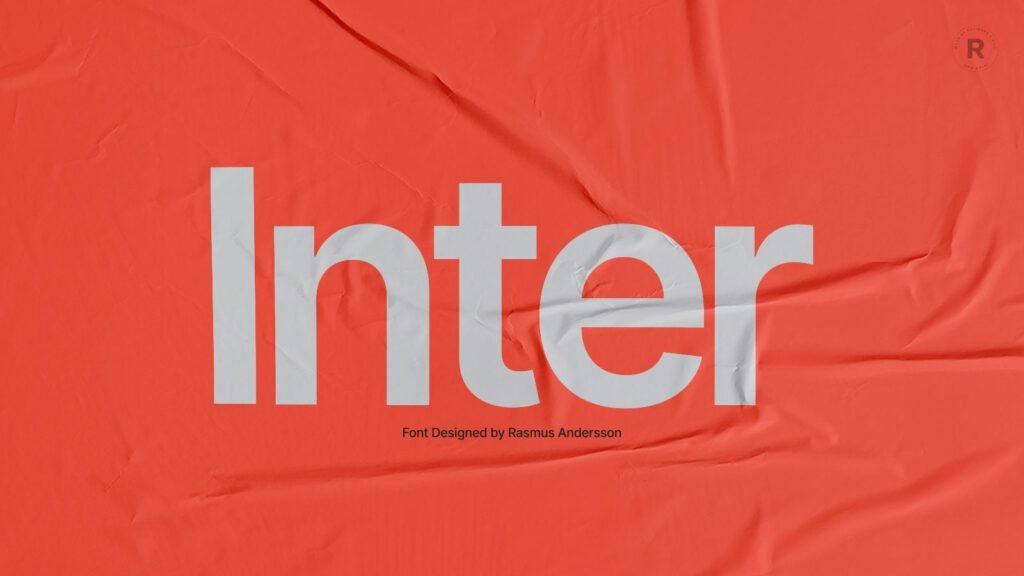
In yet another font redesign in the 21st century, Inter UI debuted in August 2017 under the name Interface before being swiftly renamed. Leading the charge in Inter's development is Rasmus Andersson, a Swedish software enthusiast who lives in San Francisco. Welcoming collaboration, the project is open for contributions on GitHub, allowing enthusiasts to refine and expand this thoughtfully designed variable font family.
In the realm of fonts designed for computer screens, Inter takes centre stage. Meticulously crafted, it prioritises readability with a tall x-height, ensuring clear and legible text in both uppercase and lowercase.
What sets Inter apart is its versatility as a variable font. Loaded with handy OpenType features, such as contextual alternates that adjust punctuation based on surrounding glyphs, a slashed zero to distinguish it from the letter "o," and tabular numbers, it is a flexible and user-friendly choice.
Classified as a geometric neo-grotesque, Inter shares a stylistic kinship with fonts like Roboto, Apple San Francisco, Akkurat, Asap, and Lucida Grande. While making some trade-offs to enhance performance at small sizes, Inter remains an excellent choice for various screen applications.
Where can you buy it from, and how much does Inter cost?
This open-source font is free for use in any personal or commercial project. It gets even better—you can effortlessly create your versions with personal changes. While you're free to use Inter commercially, such as bundling it with a product or service to make money, please note that selling Inter itself or any derivatives of Inter is not permitted. Feel free to reach out if you're interested, and we can discuss it further.
Date released
2017
Designed by
Rasmus Andersson
Number of fonts in Complete Family Pack
9 Typefaces
Licence
Completely Free
06. Lato

Meet Lato, a sans-serif typeface family designed by Łukasz Dziedzic in the summer of 2010. "Lato" translates to "Summer" in Polish, capturing the essence of its origin. Published under the open-source Open Font License by Poland in December 2010, Lato found support from Google.
Lato has evolved, boasting an extensive family with 3000+ glyphs per style. The 2010 version now caters to over 100 Latin-based languages, 50+ Cyrillic-based languages, Greek, and IPA phonetics. Incorporating the new 2.0 version into web projects is a breeze with Adobe Typekit.
The semi-rounded details infuse warmth into Lato, creating a friendly yet serious vibe, aptly described by Łukasz as "Male and female, serious but friendly. With the feeling of the Summer." Lato adapts gracefully to various design needs by offering nine weights, plus corresponding italics, including a delicate Hairline style. Note: The hairline style is best suited for very large sizes.
Whether you're using IE, Firefox, Safari, or Chrome, take a moment to explore Lato and visualise your text in this versatile and stylish typeface!
Where can you buy it from, and how much does Inter cost?
Lato is a versatile font that can be used for both personal and commercial purposes without any cost. However, it's worth noting that there are slight differences between the versions available on Google Fonts and Typekit, an Adobe product. You'll encounter the older version (1.0) on Google Fonts, while the release date for Lato 2.0 on Google Fonts remains unknown. For the most updated version, you can explore Lato on Typekit.
Date released
2010
Designed by
Łukasz Dziedzic
Number of fonts in the Futura Complete Family Pack
18 Typefaces
Licence
Free + subscription Base
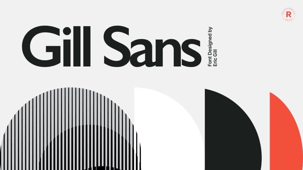
07. Gill Sans
English artist and type designer Eric Gill created the popular Gill Sans® font, which was released by Monotype from 1928 to 1930. Monotype's font expert Stanley Morison played a crucial role in Gill's font creations. Morison's vision for a contemporary face led him to choose Gill, whose early work with calligrapher Edward Johnston on the London Underground signage set the stage for Gill Sans. Gill's alphabet has a classical touch, featuring his signature flared capital R and eyeglass lowercase g. Gill Sans, a humanist sans-serif with some geometric elements, has a distinctly British feel. It is legible and modern, with lighter weights suitable for text and bolder weights ideal for eye-catching typography.
In the early 20th century, Eric Gill, renowned for his expertise in wood engraving, sculpture, and calligraphy, collaborated with Monotype to bring Gill Sans to life in 1928, alongside Perpetua and Joanna.
Gill Sans' enduring success lies in its unique foundation—Roman character shapes and proportions, distinguishing it from typical sans-serif fonts. Each variant in the Gill Sans family, from light to ultra-bold, has its character, avoiding the monotony seen in other sans-serif designs. The typeface exudes warmth and humanity, making it a standout choice in the world of sans-serif fonts.
Where can you buy it from, and how much does Gill Sans cost?
The 15 typefaces cost around $536.99 and are available on MyFonts and Fonts.com. Gill Sans® is a trademark of The Monotype Corporation, registered in the United States Patent and Trademark Office and may also be registered in certain other jurisdictions.
Date released
1928
Designed by
Eric Gill
Number of fonts in Complete Family Pack
15 Typefaces
Licence
Paid
08. Roboto

In the diverse landscape of digital design, Roboto emerges as a standout sans-serif typeface, renowned for its clean design and open-source ethos. Developed by Christian Robertson in 2011, Roboto serves as the default font for Android and Chrome OS, as well as a recommended choice for Google's Material Design.
Roboto, with its dual nature of a mechanical skeleton and friendly curves, offers a modern yet approachable aesthetic. Unlike some typefaces, it maintains a natural width, enhancing readability.
The font family, available in eighteen styles, caters to diverse design needs. Whether you opt for the regular family or explore variants like Roboto Condensed and Roboto Slab, designers can enjoy flexibility and consistency.
Google Fonts, dedicated to democratising design, collaborates with designers worldwide, exemplified by the open-source availability of Roboto. To contribute or engage with the community, visit github.com/google/roboto. Join the conversation, share insights, and play a part in shaping the future of this iconic open-source typeface.
Where can you buy it from, and how much does Roboto cost?
Downloading this font is straightforward, and there are two convenient methods to acquire it: Google, GitHub, and Typekit. Whether you're working on a personal endeavour or a commercial project, Roboto's open-source license ensures flexibility and accessibility for all.
Date released
2011
Designed by
Christian Robertson
Number of fonts in the Futura Complete Family Pack
18 Typefaces
Licence:
Free
09. Avenir

Adrian Frutiger and Monotype Type Director Akira Kobayashi collaborated to create the Avenir Next font family, an expanded version of the original released in 2004 by Linotype. The Avenir, meaning "future" in French, was a real alternative to the Futura design. The first version had three weights with italics, but Frutiger and Kobayashi revised it in the early 2000s due to limited options.
The result? The Avenir Next design was launched in 2004 with twenty-four different styles, including Regular, Italic, Condensed, and Condensed Italic. People love it for being easy to read and versatile, and designers worldwide use it for various projects.
Since its release, the Avenir Next design has been extremely popular for a wide range of applications, both in print and on screens. In 2019, Office reviewed its font collection, identified some missing styles, and added over 100 new fonts. Now you can find classics like Avenir Next LT Pro and Walbaum, as well as modern designs like The Hand, Sagona, and Modern Love. These fonts are available in most Office apps and are included in new templates, making it easier for everyone to create cool content.
Where can you buy it from, and how much does Avenir cost?
You can purchase the entire collection of 12 typefaces for $345.99 from MyFonts and Fonts.com. While there are other places where you can buy this font, I'm mentioning the ones I trust and personally use for font purchases. This collection supports at least 33 languages.
Date released
2004
Designed by
Adrian Frutige
Number of fonts in Complete Family Pack
12 Typefaces
Licence
Paid
10. Montserrat

Julieta Ulanovsky started working on the Montserrat font project in 2010 while studying typeface design at the University of Buenos Aires. As a postgraduate student, she initiated the project to bring back the charm of urban typography seen in old posters and signs in Buenos Aires' Montserrat neighbourhood from the early 1900s.
To make this font accessible to everyone, Julieta launched it as a Kickstarter project in 2011 and later released it to the public through Google Fonts. Inspired by the beauty of vintage typography, the aim was to preserve what makes Montserrat unique and share it freely under the SIL Open Font License.
Since its inception, Montserrat has evolved through collaborations with various designers. In 2015, Julieta teamed up with Ale Paul, Carolina Giovagnoli, Andrés Torresi, Juan Pablo del Peral, and Sol Matas to develop a full set of weights and italics. In 2017, Jacques Le Bailly revamped the Latin design, and Juan Pablo del Peral and Sol Matas worked on the initial Cyrillic extension with input from Maria Doreuli and Alexei Vanyashin. Lasse Fister, Kalapi Gajjar Bordawekar, and Marc Foley conducted the technical reviews. Special thanks were extended to Thomas Linard, Valeria Dulitzky, Belén Quirós, and Germán Rozo.
Where can you buy it, and how much does it cost?
Montserrat is available under an open-source license, allowing you to use it seamlessly with your Adobe Fonts account or via Google Fonts.
Date released
2010
Designed by
Julieta Ulanovsky, Sol Matas, Juan Pablo del Peral, Jacques Le Bailly
Number of fonts in Complete Family Pack
40 Typefaces
Licence
Free
Frequently Asked Questions (FAQS)
- What are Sans-Serif Fonts?
Speaking of sans-serif, this term refers to a typeface or font that lacks the small projecting features, known as serifs, at the end of strokes. In a sans-serif font, characters exhibit clean and simple lines, avoiding the additional embellishments in serif fonts. This distinction may seem subtle, but it can have a significant impact on the overall aesthetic of your design. - Which is the first Sans-Serif font?
Introduced in 1816 by William Caslon IV, Two Lines English Egyptian is the first sans-serif font. Caslon emerges as the unsung hero, paving the way for the elegance and simplicity that define clean fonts! - Sans Serif vs Serif?
Sans Serif and Serif are two main categories of fonts, differing in the presence or absence of small lines, known as serifs, at the ends of characters. Sans-serif fonts, such as Arial or Helvetica, have a clean and modern appearance but lack serifs. They are often used for digital displays, headlines, and contemporary designs due to their simplicity. Serif fonts, such as Times New Roman or Georgia, feature decorative strokes at the ends of characters, conveying a more traditional and formal look. Serif fonts are commonly used in print, like books and newspapers, where the serifs contribute to improved readability.
Resources
- myfonts.com (Paid + Subscription Based)
- typography.com (Paid)
- behance.net/assets/fonts (Free + Trail Version + Paid)
- https://fonts.adobe.com (Subscription Based)
- https://fonts.google.com (Free)
