
Are you struggling to find the right font pairings, especially if you don't have a background in typography? I understand. I have worked with leading brands such as Ethos, Favre Leuba, Second Movement, Oris, Carl F. Bucherer, and many other luxury brands. I've put together font combinations that bring elegance and functionality to any of your luxury brands.
What were my challenges?
As a designer growing up in 90s India, I was constantly confronted with poor typography choices—on packaging, in newspaper ads, or on TV. Good fonts were a rarity; the visual landscape felt cluttered with uninspired, often downright ugly, type. Even design schools at the time rarely focused on the importance of typography, leaving many of us to figure it out on our own.
Despite the many options on the internet, from free to paid, everyone gravitated towards the same popular combinations found online, including me. Many fonts in my library went unused, and I often relied on the tried-and-tested options.
During my extensive experience in the watch and luxury industries, I encountered similar challenges when selecting fonts for premium brands. Over time, I have curated font combinations that stand out and save time—fonts proven to work. Iconic brands like Baume & Mercier, Rimowa, Jacob & Co., Carl f. Buchere and other well-known brands even use some of the combinations.
In this design basics series, I will share my go-to font pairings for luxury projects—font combinations that have been tried, tested, and proven to add elegance and efficiency to your designs. Below are practical fonts that work in the real world—tried and tested by big and small brands with a wealth of versatile glyphs to meet your needs. These fonts are readily available from trusted sources such as Adobe Typekit, Google Fonts, and official platforms like MyFonts. Depending on the project budget and client requirements, these combinations can be mixed and matched for stunning results.
1. Brother 1816 + Mrs Eaves
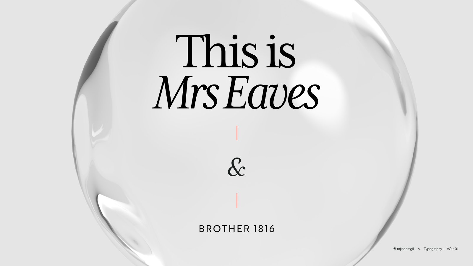
Brother 1816
Designed by Fernando Díaz and Ignacio Corbo.
A clean, versatile sans-serif font with a modern, geometric design. It’s perfect for branding, editorial design, and digital use, offering readability and style.
Mrs Eaves
Designed by Zuzana Licko. From Emigre.
Designed in 1996 by Zuzana Licko, Mrs Eaves is inspired by the 1757 Baskerville typeface and named after Sarah Eaves, John Baskerville’s housekeeper and wife.
2. Baskerville + Open sans
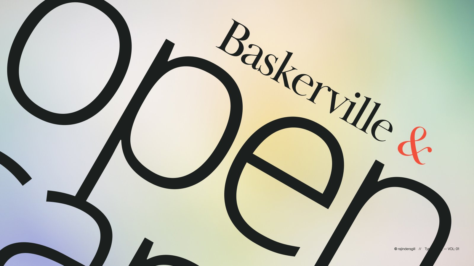
Baskerville
Designed by Arina Alaferdova and Dmitry Kirsanov.
A refined serif font inspired by classic typography. It combines elegance with readability, making it ideal for books, editorial design, and branding projects.
Open sans
Designed by Steve Matteson
A clean, modern sans-serif font known for its versatility and readability. Designed by Steve Matteson, it’s widely used in web and print design for its neutrality and clarity.
Bodoni 72 + Futura PT
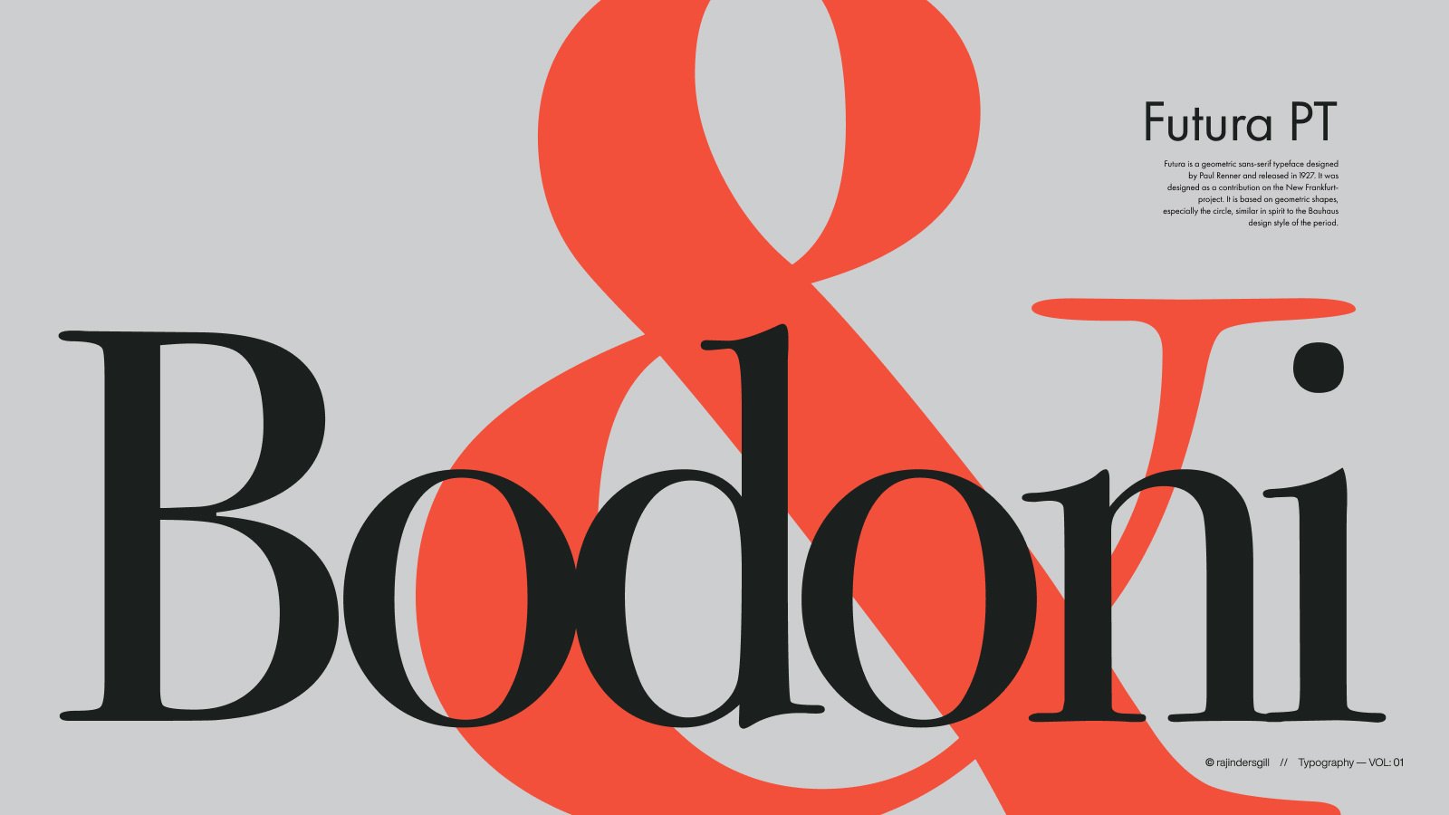
Bodoni 72
Designed by Giambattista Bodoni
Renowned for its elegant, high-contrast letterforms and geometric structure, it’s ideal for formal and stylish designs. Often used in print, it exudes sophistication and timeless beauty, making it a favourite in luxury branding and editorial work.
Futura PT
Designed by Isabella Chaeva, Paul Renner, Vladimir Andrich, and Vladimir Yefimov.
It’s known for its distinctive shapes and strong visual impact, making it versatile for various design applications. It is Ideal for headlines and body text and exudes a sleek, contemporary vibe.
Big Caslon + P22 Underground
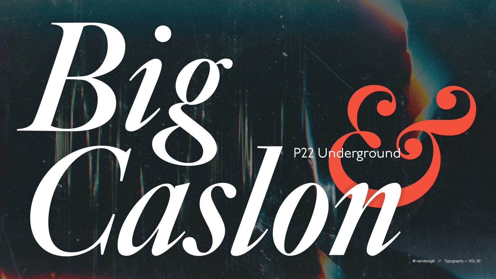
Big Caslon
Designed by Matthew Carter.
Big Caslon is perfect for high-impact headings and traditional print and combines historical grace with a bold presence, making it ideal for timeless designs.
P22 Underground
Designed by Edward Johnston, Paul D. Hunt, and Richard Kegler.
A distinguished serif typeface celebrated for its classic old-style elegance. With robust serifs and a spacious design, it lends a sophisticated, timeless quality to headlines and body text, making it perfect for traditional and impactful designs.
Didot + Avenir
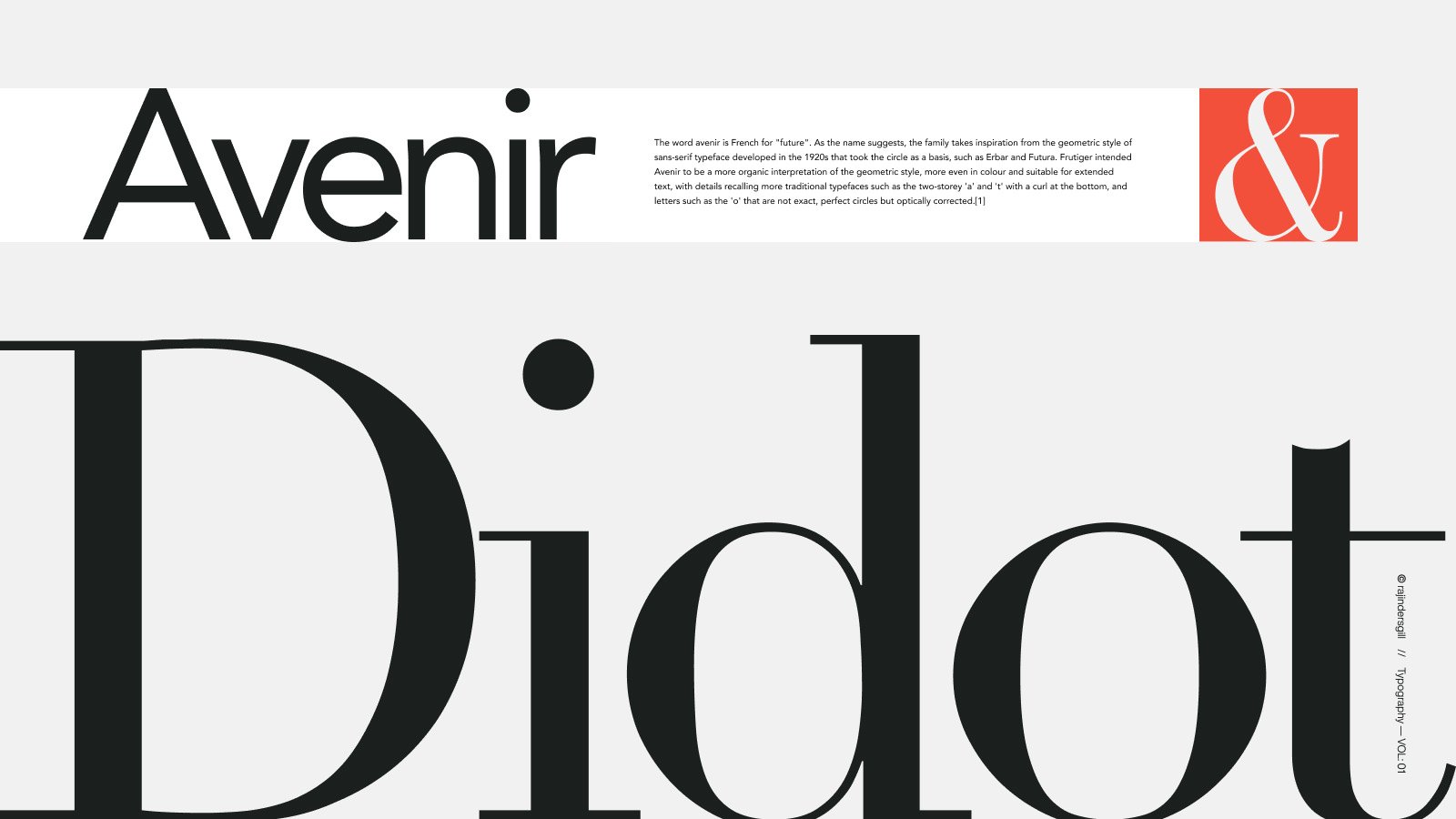
Didot
Designed by Firmin Didot
Its robust serifs and generous spacing create a sophisticated and timeless appearance, making it an ideal choice for headlines and body text. The typeface’s enduring charm and impactful presence make it a staple for traditional design projects that demand a touch of historical grace.
Avenir
Designed by Adrian Frutiger
The name “Avenir,” meaning “future” in French, reflects its modern and timeless design. Its versatility makes it ideal for various applications, from digital interfaces to printed materials, offering both elegance and readability.
Prata + DM Sans
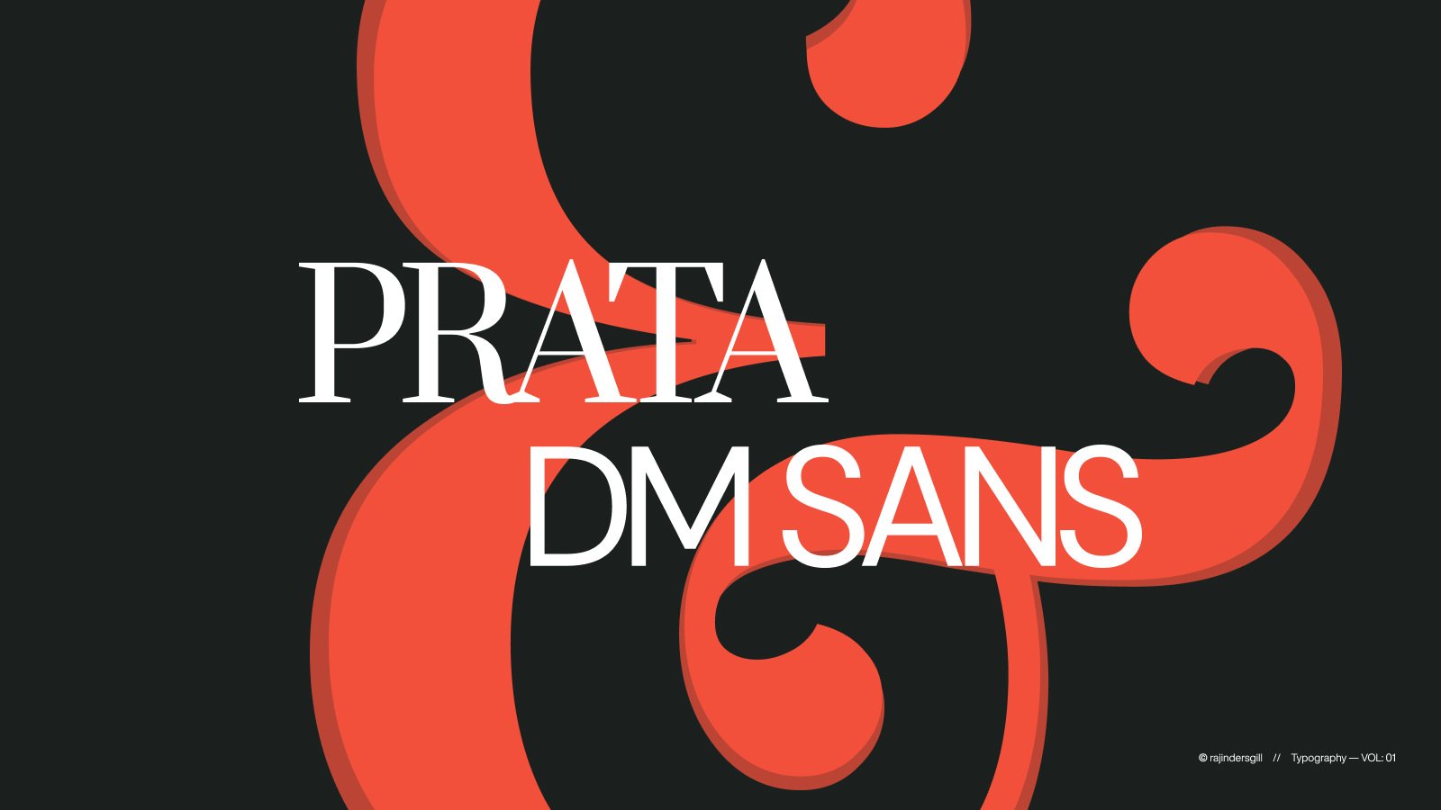
Prata
Designed by Cyreal
Known for its refined and sophisticated aesthetic, Prata features high contrast between thick and thin strokes, which gives it a distinguished and modern appearance. It’s ideal for upscale branding, editorial design, and any project requiring classic elegance and readability.
DM Sans
Designed by Colophon Foundry
DM Sans is a low-contrast geometric sans-serif typeface designed for optimal readability at smaller text sizes. Created by Colophon Foundry (UK), it builds on the Latin portion of Indian Type Foundry’s Poppins.
Americane + Proxima Nova
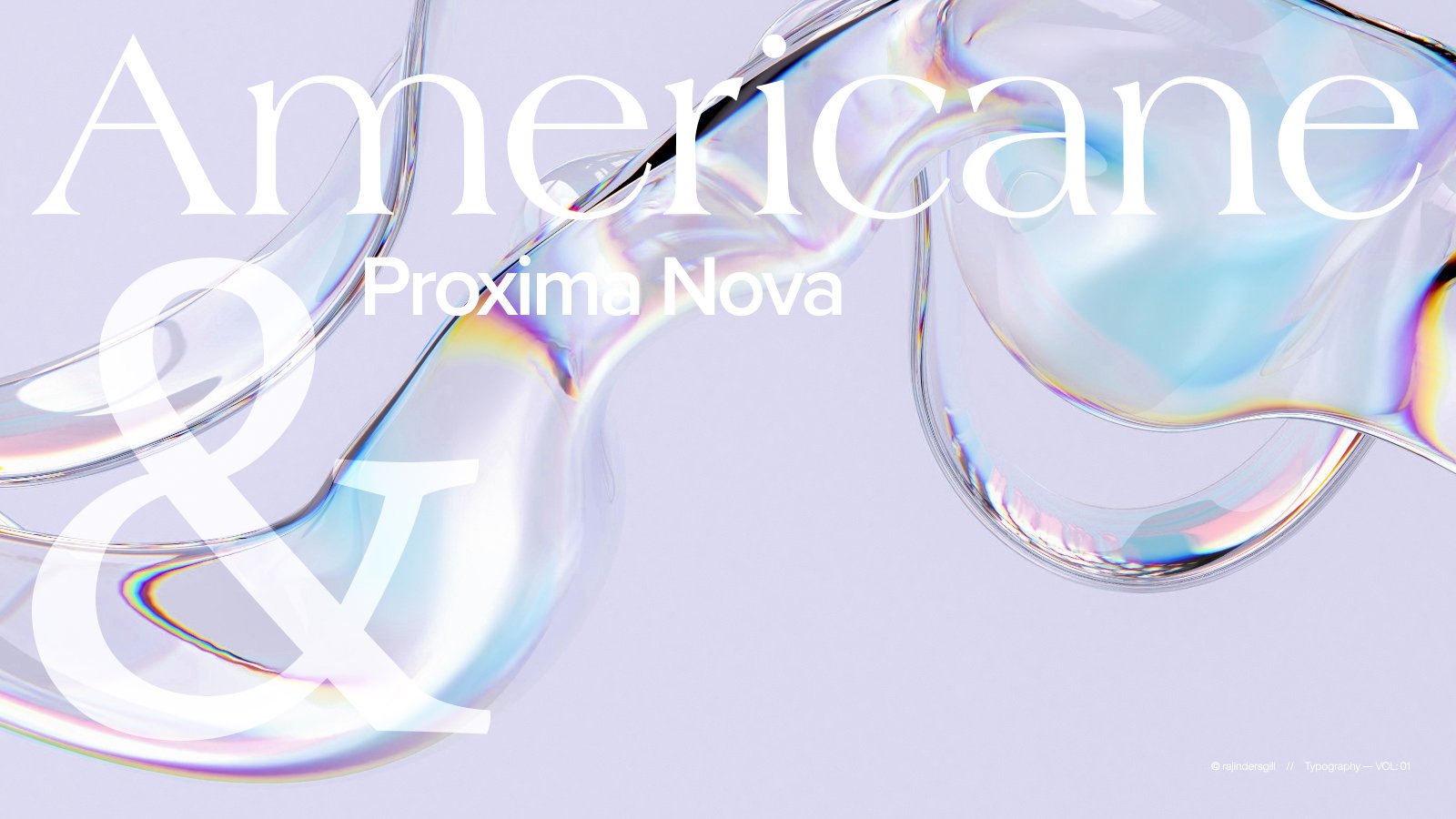
Americane
Designed by Hannes von Döhren. From HVD Fonts.
Designed with a focus on readability and contemporary design, it features simple, straightforward lines that make it suitable for various applications, from branding to user interfaces. Its clarity and balanced proportions contribute to its display and text settings effectiveness.
Proxima Nova
Designed by Mark Simonson. From Mark Simonson Studio.
Released in 2005, Proxima Sans is an evolved version of Proxima Sans (FontHaus, 1994). It blends the roundness of geometric sans serifs, like Futura, with the proportions of modern grotesques, such as Helvetica. It offers many styles, including Condensed and Extra-Condensed versions.
Adobe Garamond + Gill Sans
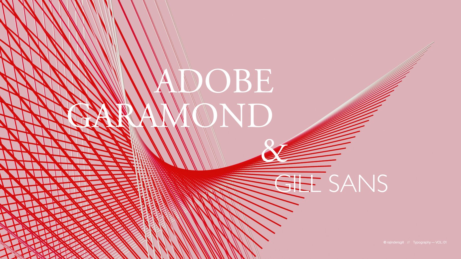
Adobe Garamond
Designed by Robert Slimbach.
An Adobe Originals design and the company’s first historical revival is a digital interpretation of Claude Garamond’s Roman types and Robert Granjon’s italics. Released in 1989, it has become a staple in desktop typography and design, celebrated for its classic elegance and historical significance.
Gill Sans
Designed by Eric Gill
Gill Sans, rooted in Edward Johnston’s 1918 London Underground design, features classical proportions with distinctive elements like the flared capital “R” and eyeglass lowercase “g.” A humanist sans serif with geometric touches, it exudes a British charm. Its lighter weights suit text, while bolder weights excel in display typography.
Georgia + Helvetica (1957)
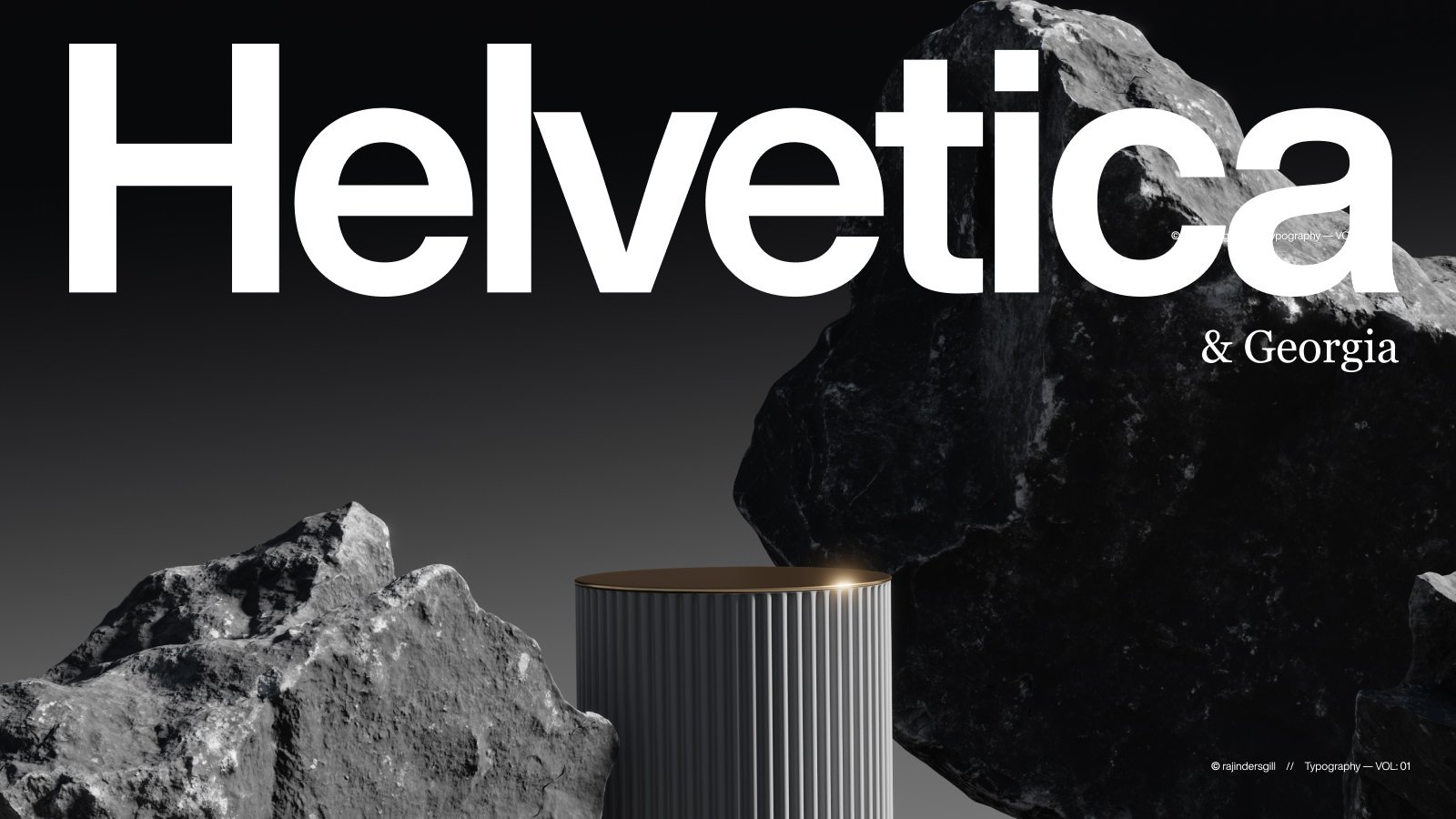
Georgia
Designed by From Carter & Cone.
This serif typeface, designed for Microsoft in 1993, was intended to be highly legible on low-resolution screens. With its classic, sturdy letterforms and generous spacing, Georgia blends traditional elegance and modern readability. It’s widely used for web and print and is known for its clarity and timeless appeal.
Helvetica (1957)
Designed by Max Miedinge
Helvetica, created in 1957 by Eduard Hoffmann at the Haas foundry in Switzerland, is a sans-serif typeface named after "Helvetia," the Latin word for Switzerland. Developed to rival the success of Akzidenz Grotesk by H. Berthold AG, Helvetica's clean, modern design became an iconic, versatile, and neutral typeface in global design.
Sculpin + Petersburg

Sculpin
Designed by Eric Olson
Sculpin is a typeface inspired by the precise finishing details of square-edged tools like chisels and brushes. Its design hooks together high-contrast joins sharp cuts, and reverse terminations, reeling in a collection of visual cues that seamlessly thread the letters together, creating a cohesive and well-crafted look.
Petersburg
Designed by Vladimir Andrich and Vladimir Yefimov.
The Petersburg Font Family offers a refined, classic aesthetic inspired by the elegant typography of historical Russia. With various styles and weights, it blends traditional serif forms with contemporary nuances, making it versatile for print and digital applications.
